Tuft & Needle was established on an anthemic philosophy of excellent customer service above all. For the founders, this meant sticking to one product and doing it exceptionally well, eschewing promotions in favor of "the same fair price year-round," and ensuring every interaction with the customer experience (CX) team was full of surprise and delight. These philosophies shaped our custom tooling as well.
But as the mattress industry became increasingly commoditized, newly acquired Tuft & Needle decided on a new product and promotional strategy to better compete in the overcrowded marketplace. And so, the team began overhauling the order management system to support 10x the products and continual overlapping promotions.
Building and allocating the team to support new company objectives
As the Head of Design, I built the in-house design team to support the company's objectives. I also created the design strategy for how we would support this new change in company philosophy. Since Tuft & Needle was not a Saas company, understandably, getting approval to allocate significant resources to overhaul internal tooling required some positioning. I explained the importance of this project to the executive leadership team and worked with the CTO to get it on the roadmap. Given this project's complexity, I assigned it to my most senior product designer. I knew she could handle the complex flows and problem solve amidst copious amounts of tech debt. I had been grooming her to be a strong design facilitator, and I knew her skills in this, coupled with her user research chops, would keep the project on track and validated with testing.
A multidisciplinary research process that uncovers efficiency gains and recoups revenue
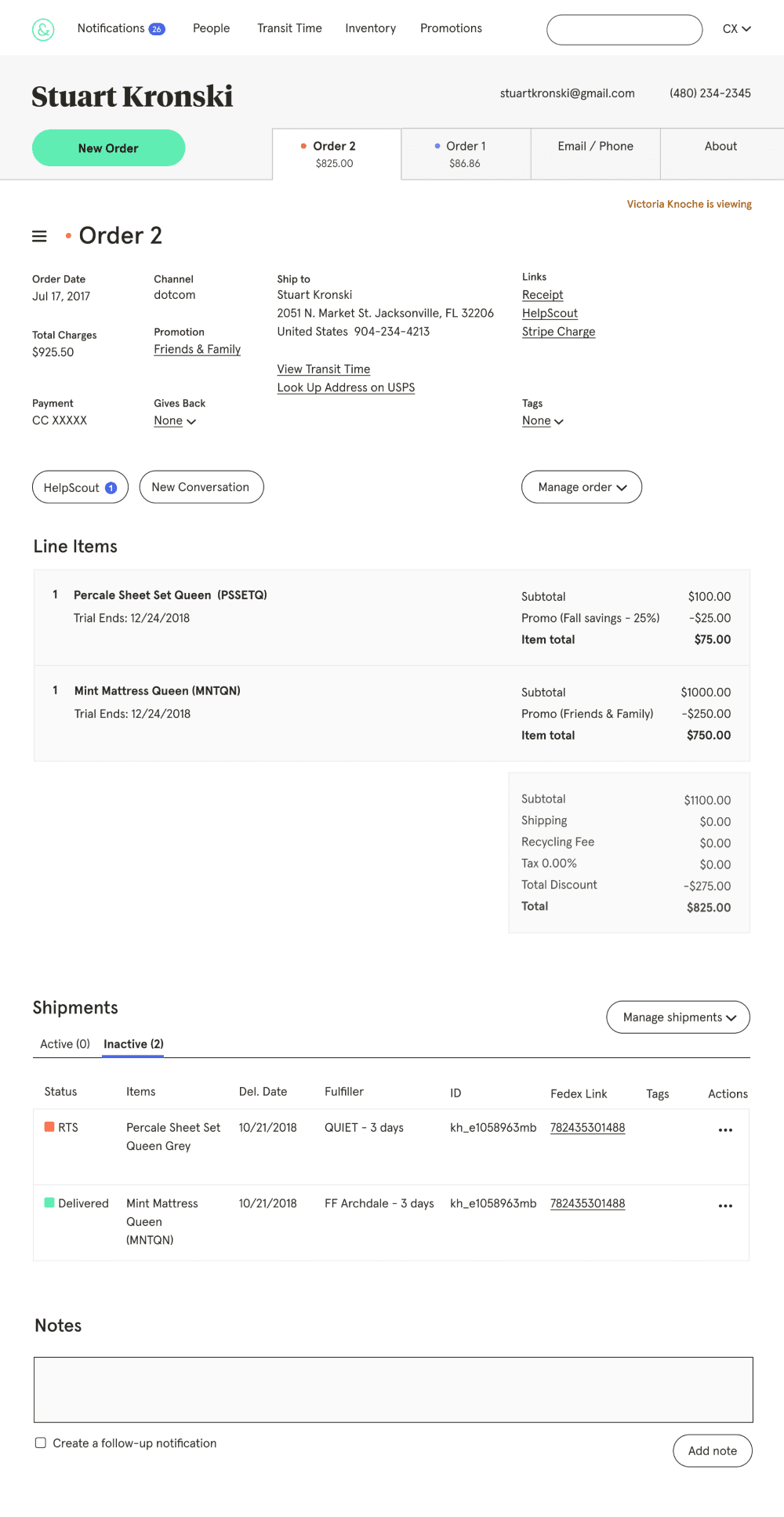
Coupling extensive user research interviews and shadowing with a multidisciplinary design sprint process, we rapidly identified the most critical problems to solve: time-consuming workflows and loss of revenue from missing functionality. Poor organization, lack of context, insufficient line-item visibility, and promotional, fulfiller, and shipping limitations created inefficiencies, bad customer experiences, and a loss of revenue.
I met with the team frequently to provide feedback and discuss limitations and other possibilities. Given our limited time and development resources, much of my guidance was about working around tech debt and other constraints to make the solution as efficient for development as possible. Done was definitively better than perfect here.

Redesigning the order summary and contextualizing the menus
More intuitive organization and hierarchy were needed as we improved workflows and added more functionality. We audited the frequency of each workflow and used that to drive placement and prominence. For example, user research revealed that while very helpful in certain situations, the timeline was not used for the most common customer experience workflows. So, we collapsed the timeline into a drawer where it was easily accessible when needed.
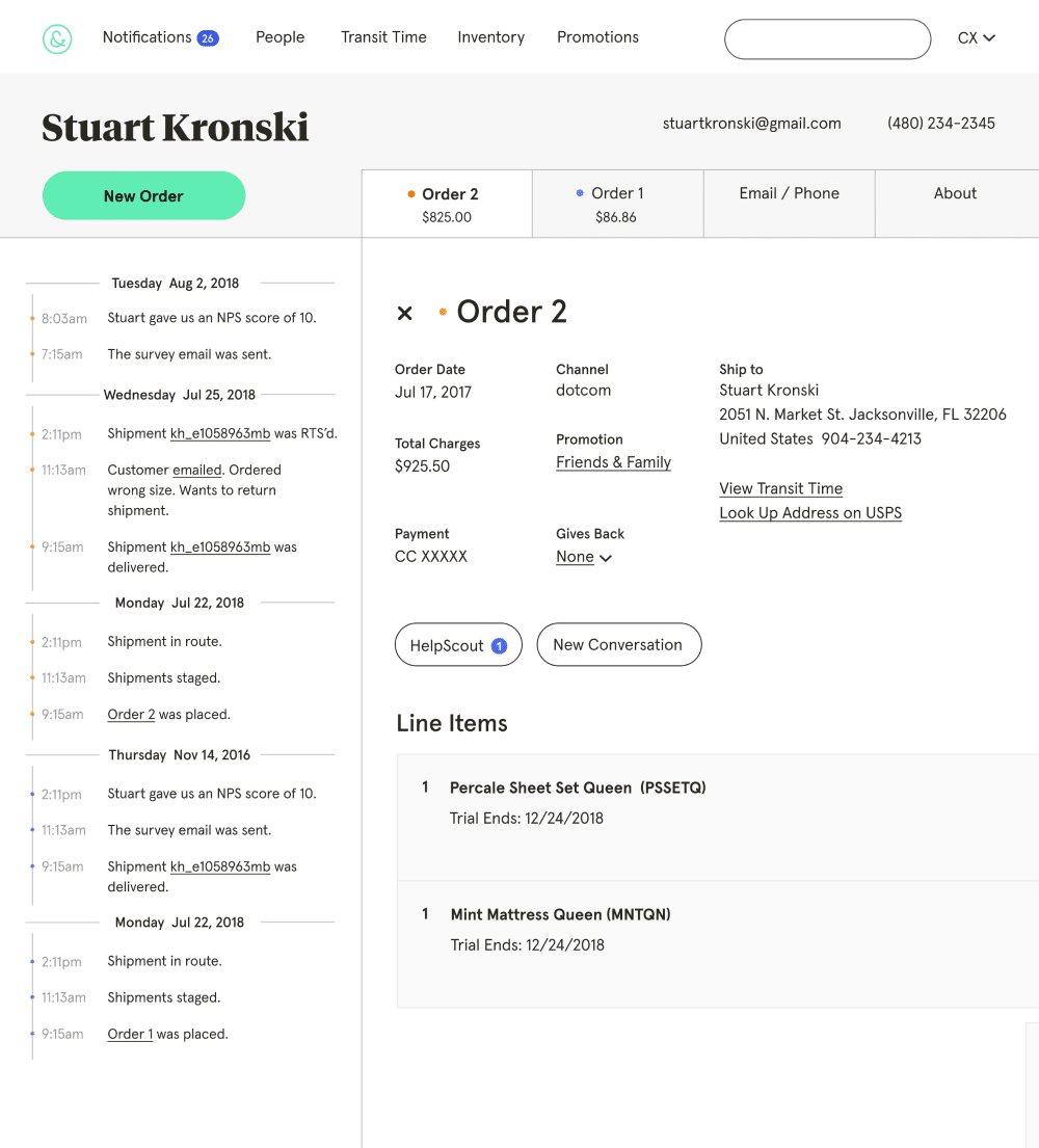
To reduce cognitive load and prioritize the most common workflows, we grouped relevant information and moved order-level actions to a contextual "Manage" dropdown. Based on the shipment status, the context logic removed non-actionable menu items from the dropdown. In addition to making CXers more efficient, making the tool more intuitive helped lower CX onboarding times.
Increasing tracking and promotion flexibility with line-item visibility
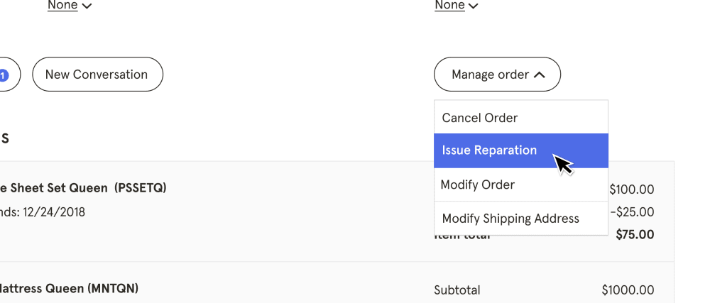
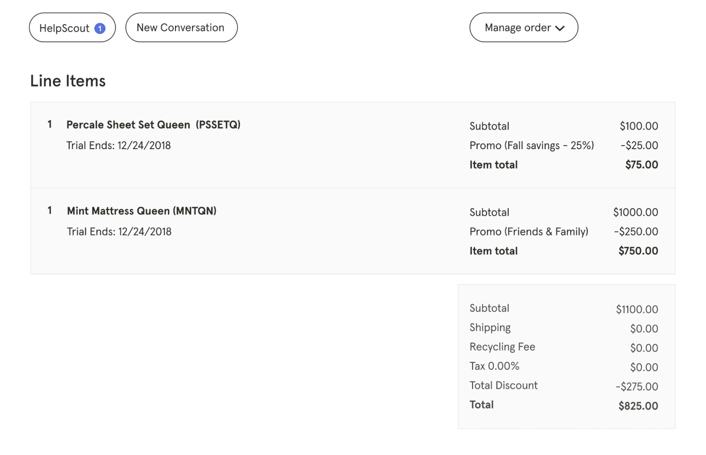
In moving from one product to many products, the line-item section became an essential part of the OMS. Order details like promotions, returns, replacements, and trial periods mapped to individual items rather than whole orders. Without this level of specificity and control, the business was losing revenue to calculation errors and fraudulent returns.
Promotions, in particular, were enhanced by line-item tracking. While Tuft & Needle did not allow multiple promotions on a single item, they did enable multiple promotions on an order as long as they were applied to different products. This line-item visibility gave the customer experience team the necessary visibility to understand which promotions were associated with which items and make edits when necessary.
Interactive shipments unlock a better customer experience, reclaim shipping costs, and increase CX capacity
Another critical area of focus was the shipments section. When reviewing customer contact reasons, 68% were related to shipments. So, streamlining processes here increased the CX team's velocity, allowing us to keep headcount low.
Although there was only a short time while an order was processing, catching issues — like canceling an order or updating the shipping address — within this period had a direct impact on net revenue. By clearly calling out the shipment status and employing contextual dropdown menus, we enabled the CX team to make these timely adjustments and saved the business unnecessary shipping costs.
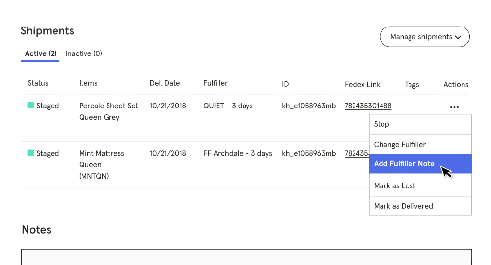
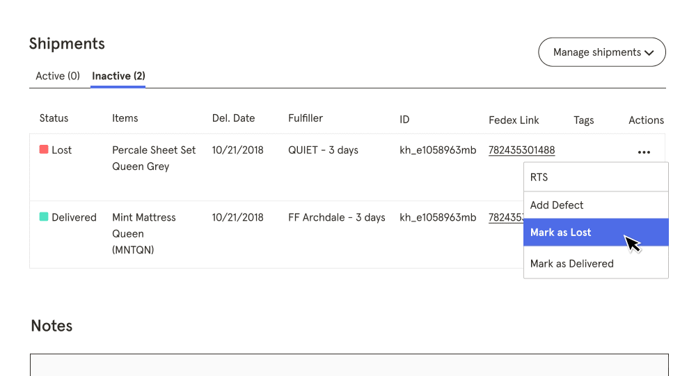
New shipment controls also unlocked several features to better serve customers, like delivery holds, changing fulfillers, expedited processing, and tracking and fixing item defects.
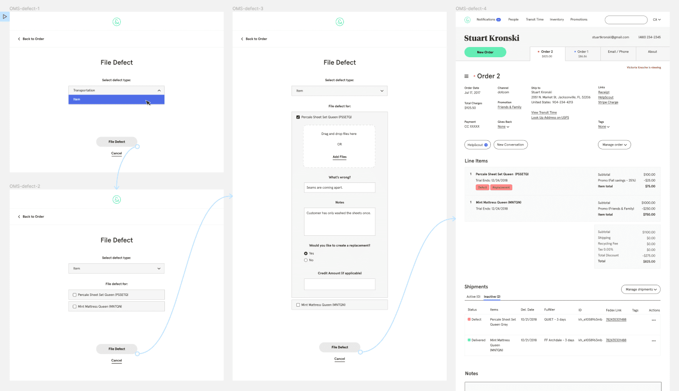
Shipment, line-item, and order summary updates unlocked promotional flexibility that allowed the company to better compete in a promotionally-heavy industry, saved unnecessary shipping costs, and enabled the CX team to work much more efficiently. While we didn't track efficiency gains directly, the CX team was able to take on managing two new brands while only increasing headcount minimally. This increase in scope was made possible in part by the efficiencies gained in this project.
Thank Yous
Beatriz Vizcaino UX & Visual Design
Breanne DeMore Copywriting
Jackson Hardaker Front-End Development
Eliza Marcum Back-End Development
Chris Cardello Engineering Leadership
Ray Rita Customer Experience
