Tuft & Needle changed the mattress industry by creating a new way to buy mattresses. Our try-at-home, bed-in-a-box model with free shipping and easy returns raised the bar on customer support and convenience. And while we created an industry that has been steadily stealing away market share from the traditional players, there’s still a majority of shoppers who buy mattresses through conventional means. Our merger with Serta Simmons Bedding (SSB) is our attempt to change the way traditional mattress companies do business, making it a better experience for customers.
In preparation for the merger, we kicked off a preliminary study to determine the most effective strategy for making quick, positive changes to Serta’s and Beautyrest’s customer experience.
Identifying the problems
After conducting some initial research and an audit of Serta’s and Beautyrest’s websites, products, and services, we determined that several things hold the brands back from having the type of customer experience that modern shoppers have come to expect.
- Too many product offerings with unclear differentiation
- Cluttered, complicated websites with confusing information architecture and convoluted purchase paths.
- Poor customer support, especially around warranty claims and returns
The configurator: a simplification of choice
We had many multidisciplinary brainstorming sessions generating and evaluating various solutions. To address items 1 and 2, we decided that the best first step was to streamline the product offerings by removing hundreds of products from the online shopping experience and merging the best-selling SKUs into a few distinct, configurable products.
Taking inspiration from the automotive and tech industries, we experimented with creating product detail pages that would allow us to offer multiple variations of a product but display them to the user in a simplified, benefit-based decision flow. We called this new type of product page a “configurator.”
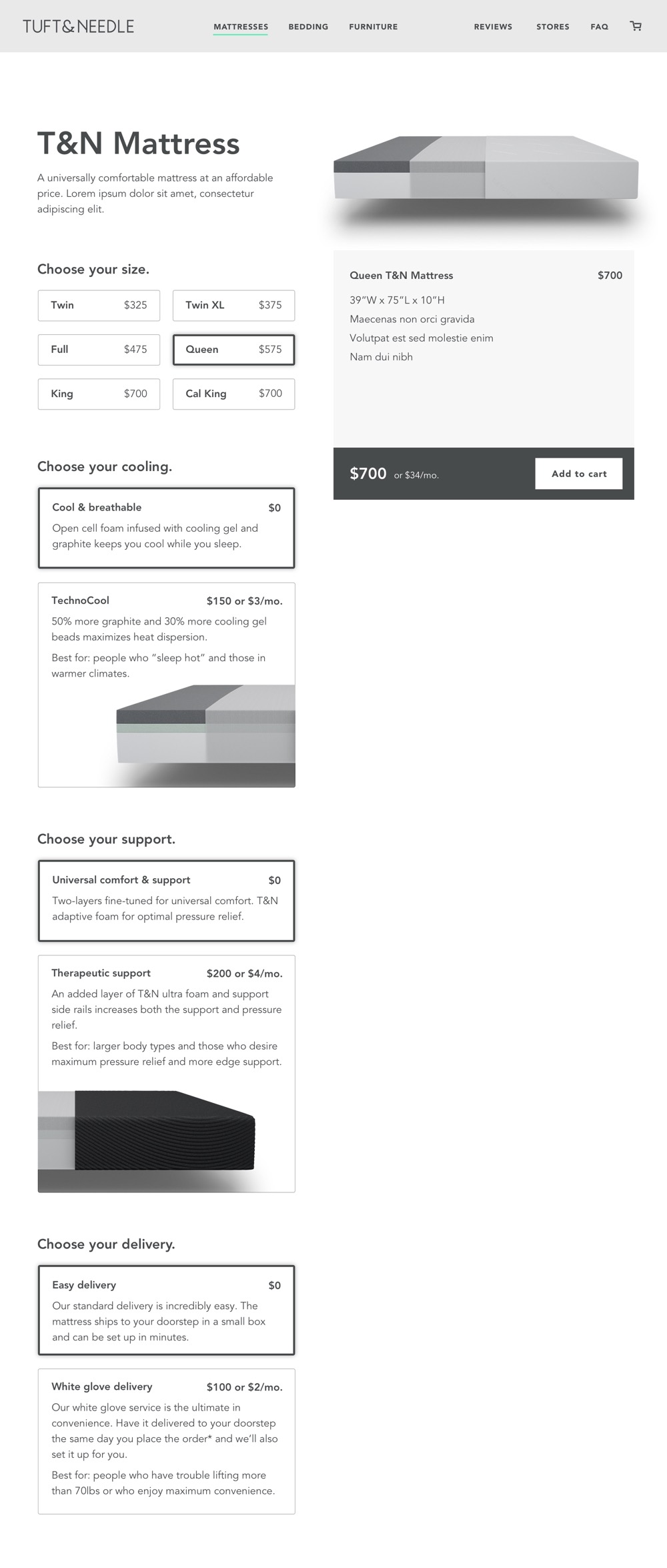
One of the critical decisions was how to display the upgrades. Should users be forced to make a selection for each option? Or should the upgrades be checkboxes that could be easily skipped? There were pros and cons to both solutions.
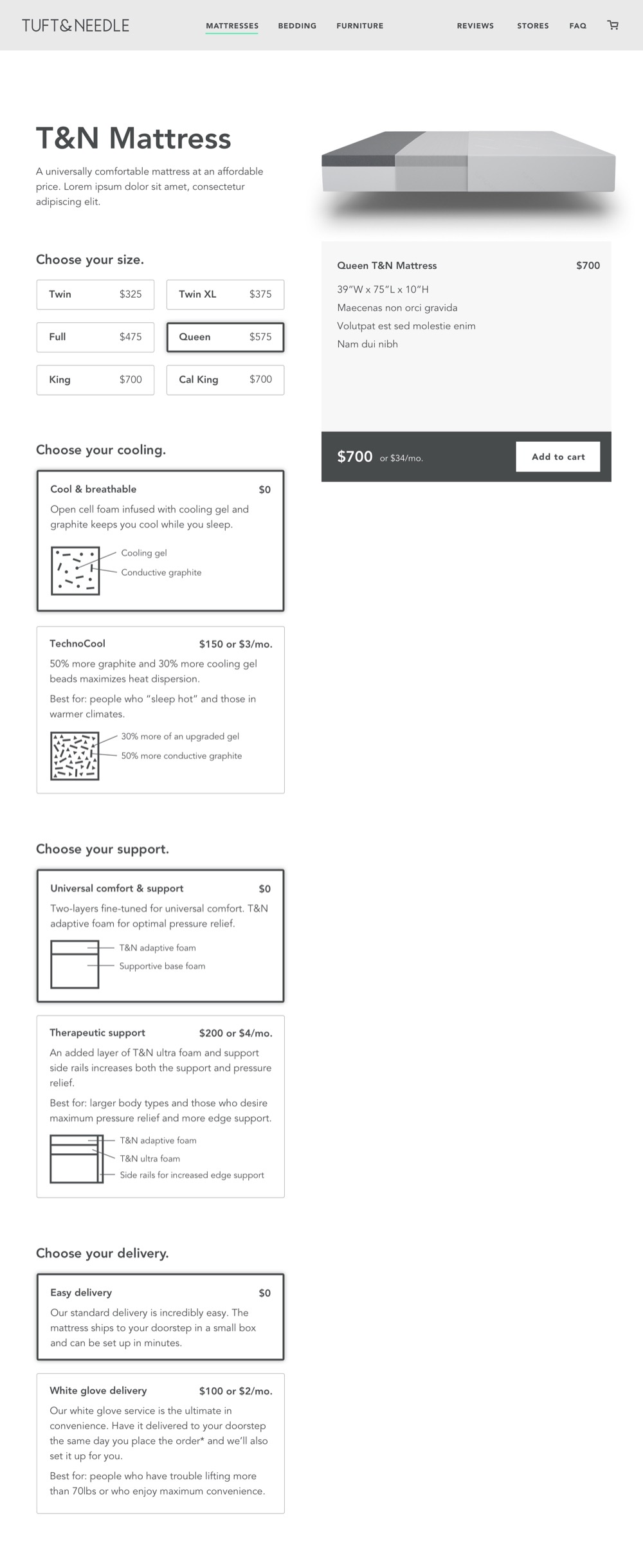
Merging four models into one: the initial prototype
I conducted eight in-person tests with the initial prototype. In this version, I took four different products and packaged them as one product with modifications. In general, the feedback was that the proposed solution was intuitive and easy to use. Although each participant was technically choosing between 4 different models, the build-your-own mattress flow helped tremendously with decision fatigue. They didn’t feel that they were choosing between distinct models. They thought they were configuring one model with the features that made the most sense to their sleep preferences.
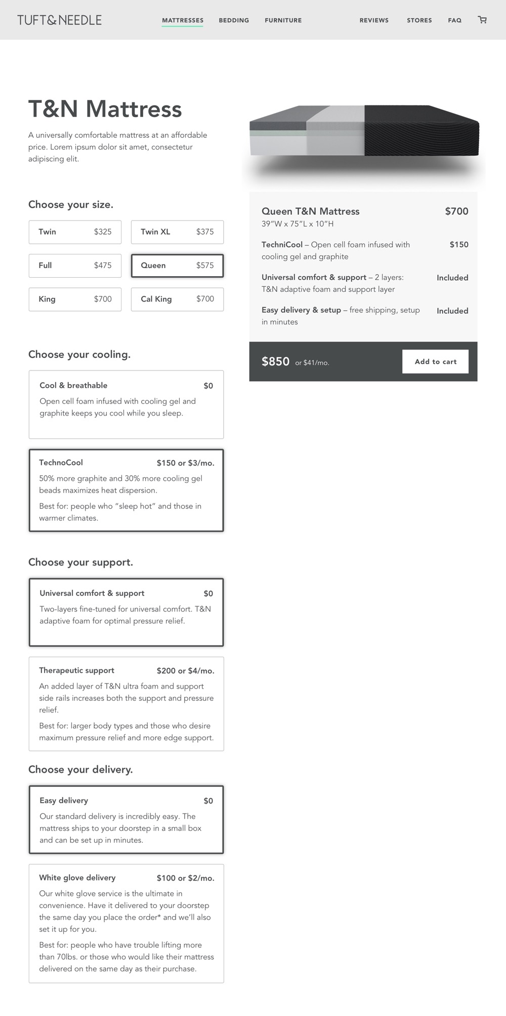
A second prototype, this time for Tuft & Needle
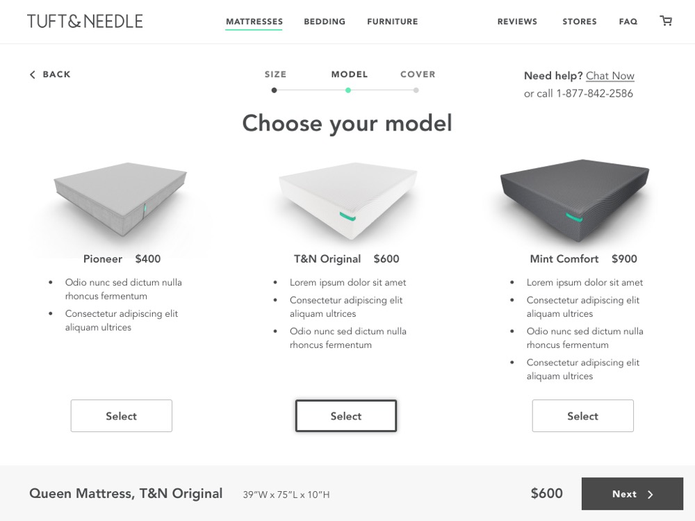
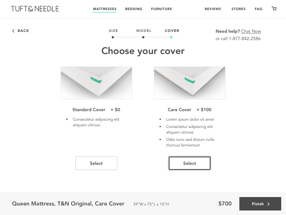
After exploring Serta’s configurator, leadership wanted to look at how it might function for Tuft & Needle. Using our existing product roadmap, I mocked up what this structure might look like for Tuft & Needle’s mattress lineup.

Convincing SSB to take the leap
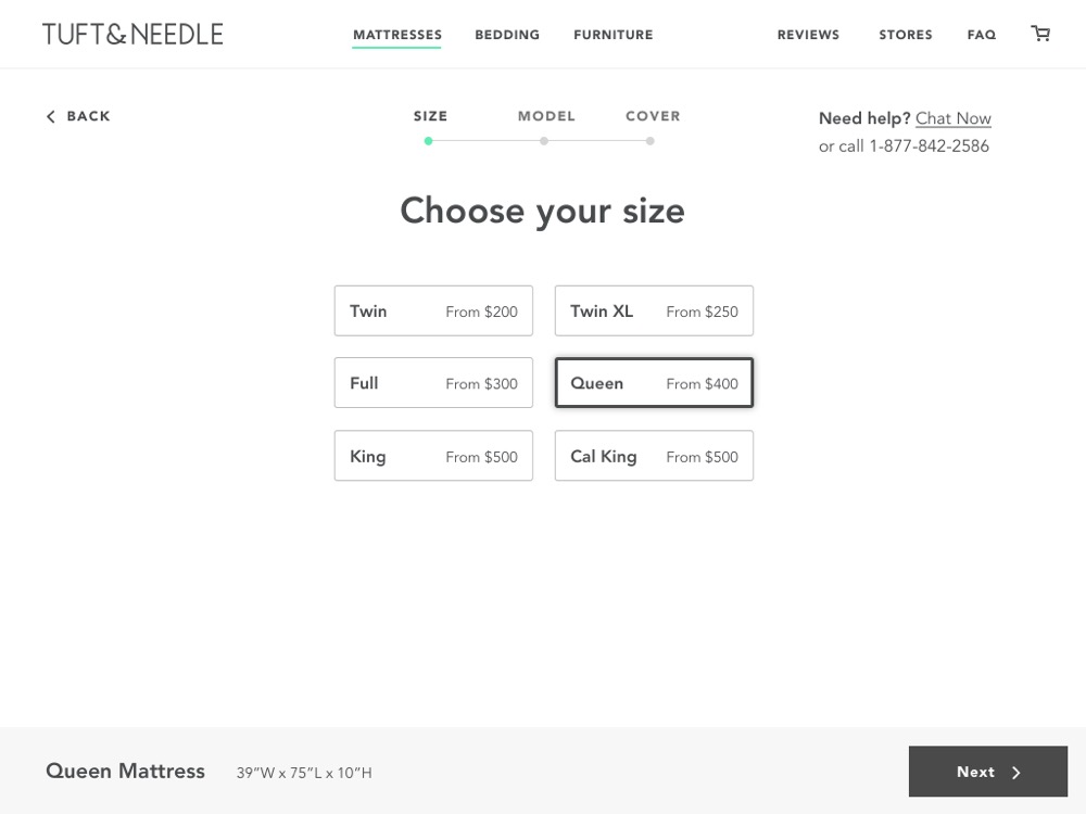
I created one other prototype for Serta that iterated on the previous designs and skinned it with their branding to help them better visualize it. We then presented the work to SSB leadership. Interestingly, seeing how the configurator and reverse lander might work for Tuft & Needle, a more successful ecommerce site, helped convince SSB of its potential for success on their sites. With these prototypes and research findings, we persuaded the SSB leadership team to move forward with this idea of configurable products.
This project laid the groundwork for the successful relaunch of custom ecommerce sites for both Beautyrest and Serta and is on track to change how both brands handle product strategy moving forward.
Thank Yous
JT Marino Strategy
Aaron Whitney Strategy
Tyler Marino Project Management


